UI/UX Design
Case Study
LPL Financial's
Video Customization Portal
Challenge
Design an application that will give advisors the ability to personalize a selection of white label marketing videos, which they can download from the Marketing Gateway.
User Story
As an independent wealth advisor, I want a way to add my business logo and contact information to white label marketing videos provided by LPL Financial for marketing purposes.
Solution
The final application was designed using a simple, progress step UI design pattern that walked advisors through the process of personalizing their selected marketing videos.
The Design Process
Discovery & Requirements Gathering
Working together with the lead Web developer, I met with internal business owners to gather requirements for the application. During the course of our discovery, the following requirements were among those identified as must-have features:
- Maintain established Marketing Gateway branding and style standards.
- Users can select from LPL’s entire library of white-label marketing videos for customization.
- Users can customize videos with a logo of their choosing.
- Users can add business contact information to a slide at the end of the video.
- Users may choose to customize the contact slide’s colors to match their business’s branding.
- Users may choose to be notified via email when their custom videos are available for download once processing is complete.
Brainstorming & Ideation
Following our stakeholder interviews, the Web developer and I got to work organizing the information we had gathered, forming ideas for how the application would look and function, and developing an action plan. I used two simple tools during this phase of design — task flow diagrams and low-fidelity sketches — to aid in the visualization of our ideas before spending time on more detailed design assets.
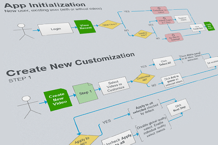
Task Flow Diagrams
Task flow diagrams are an effective tool for providing a high-level view of the steps a user will take to accomplish a given task within the application. A separate diagram was created for each task to identify important decision points and simple interactions a user would encounter while creating and downloading a custom video.
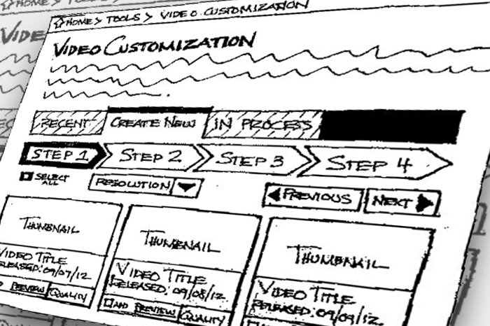
Low-fidelity Sketches
Using the task flow diagrams as a blueprint for the application design, I put pen to paper and sketched out rough ideas for the layout of the user interface. Sketching the ideas first allowed me to experiment with different layouts and test various design patterns before presenting our ideas to the stakeholders for feedback.
Wireframes and Interaction Design
At this stage, we had a good sense of the direction we wanted to go with the designs, but we were still looking for a bit more detail than we could get using sketches alone. To step up the fidelity of the designs, I created a series of wireframe layouts, and added wireflows to better describe how users would interact with the application.
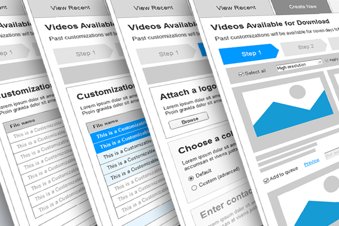
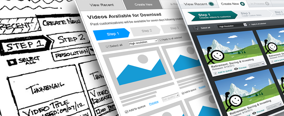
Wireframe Layouts
Medium fidelity wireframes were used to quickly iterate through layout changes without concern for non-essential details, such as images, copy, colors and typography, that would be added or changed later. The wireframes included everything we needed to communicate our design concepts to the stakeholders, while remaining simple enough that they could be modified to try out variations on-the-fly without much effort.
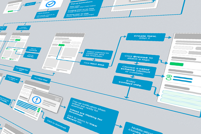
Wireflow Development
Next, I developed a wireflow diagram to describe and map out essential features of the user interface in lieu of a prototype, which takes more time and would have been overkill for this particular application. Wireflows are a useful tool for visually communicating the various interactions and touchpoints a user will encounter along their journey. They add context that task flow diagrams may lack, while remaining relatively easy to create and maintain.
Visual Design
With its structure fully planned out, I began work on the applications’s aesthetics. As the last step before handing off the design assets to the developer, I created a set of detailed hi-fidelity mockups, along with a basic typography and color style guide, defining the final look and feel of the application. The mockups and style guide served to accomplish two important goals:
- Acquire final sign-off from the stakeholders prior to beginning application development.
- Provide the developer with an approved UI which he could use as a standard for acceptance.
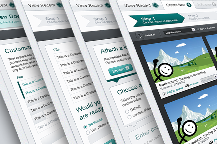
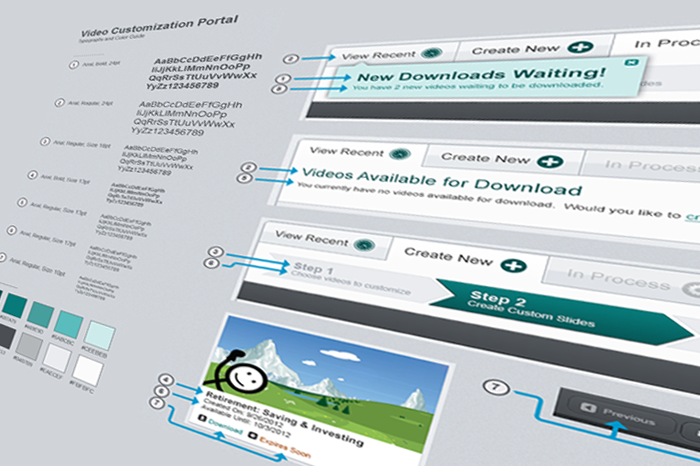
Hi-fidelity Mockups
I created a hi-fidelity mockup for each of the wireframe layouts to illustrate in detail how the finished application would look and feel to the end user. I used the Marketing Gateway's style guide as a foundation to ensure brand consistency. UI features unique to the Video Customization Portal were designed in detail to give a comprehensive view of the application in its finished state.
Typography & Colors
With a hi-fidelity view of the application fully approved for development, I created a simple style guide detailing essential elemental UI typography and colors unique to the new application's design. The details of this style guide were eventually incorporated into the greater Marketing Gateway style guide, which were then used for system maintainence moving forward.